Printing FAQ
WHAT IS RISO?
+Riso is short for Risograph. It’s a Japanese printer/printing process that is similar to screen-printing, using rich spot colours and stencils to create tactile and vibrant prints, affordably and with little impact to our environment.
HOW DO YOU CALCULATE OUT THE PRICE?
+Quotes are calculated first by the number of colours/stencils used, then with print quantity and paper selection added on the end. Like screenprinting, the initial set-up is where most of the production time is spent, and cost is weighted. The riso is designed to be a duplicator - so once the artwork is set up, it’s pennies per print.
HOW MUCH WILL IT COST?
+Prices start at £18 (This is for a one colour artwork, and one print on 100gsm paper).
Costs can be broken down into three main sections: colour stencils used, prints, and paper.
Like screen-printing, the initial set-up is where most of the production time is spent, and main cost is weighted. Therefore the most economical jobs are ones that use few colours/stencils but output high quantities, and the more expensive jobs involve many colour stencils, at a low print quantity.
CAN I PRINT MY FLYERS / CARDS / BUSINESS CARDS?
+Yes, we have a super sharp guillotine, so we can trim everything in house for you. Our purchase options now include trimming, so these are calculated automatically deepening on your product selection!
HOW WILL MY WORK LOOK IN RISO?
+You can use our print simulator, or we can mock up your bespoke artwork digitally for you, but results can never be fully simulated - so take the plunge and see what happens once it's inked up on paper. Not everything is suited to the riso process, but if you’ve read our print bible, and your artwork has been prepared well - It rarely disappoints!
CAN I PRINT 1 COPY?
+Yes - this is no problem, although printing a few extra will not cost you much more. Price per print gets much more economical the bigger the quantity.
CAN I SEE PRINTED SAMPLES?
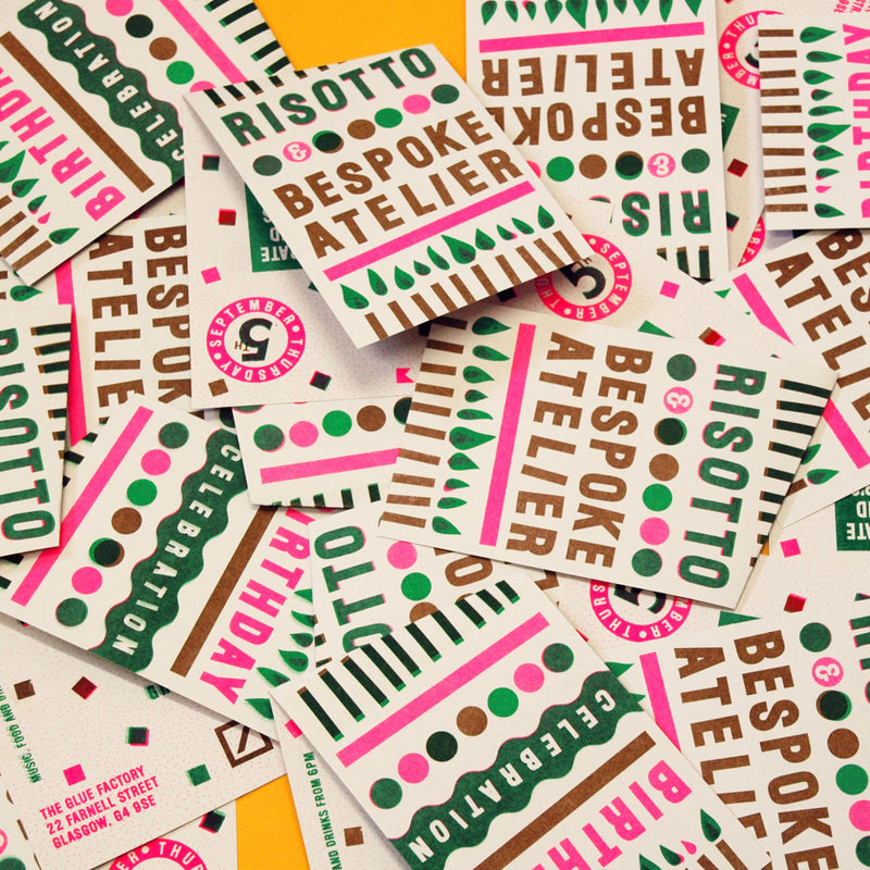
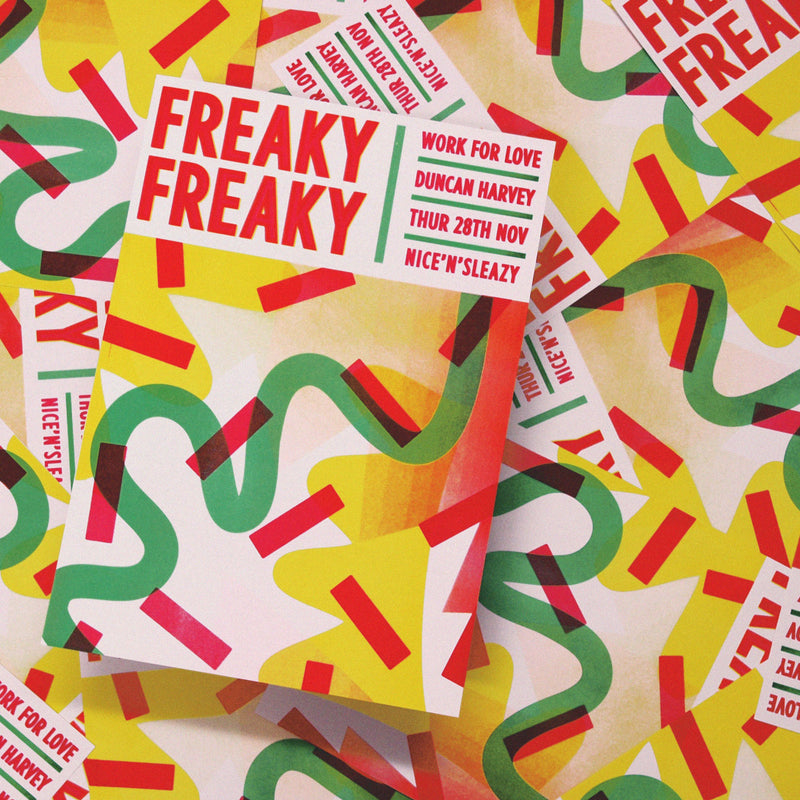
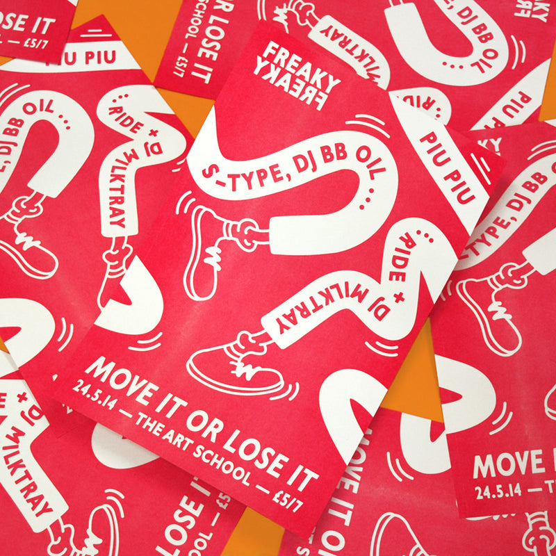
+Definitely - click here to order your sample pack, or check out our riso wall to see examples of almost every combination of inks and papers.
DO YOU OFFER ANY OTHER PRINTING SERVICES, OTHER THAN RISOGRAPH?
+Only Risograph printing - Our machine takes paper A3 (420mm x 297mm). We regularly trim down to size for smaller outcomes, like Flyers, or Business Cards.
CAN I PRINT MY BUSINESS CARDS?
+Yes, we have a super guillotine, so we can trim everything in house for you. You can download our templates to layout your cards on an A3 sheet, and then submit your order, by choosing 'Business Cards' on the second step.
CAN I GET A PRINTED PROOF?
+Due to the nature of the RISO process, print proofs aren't common.Most of the overall job cost is in the initial ‘master making’ and artwork set-up; and where most of the time/labour is weighted.
A proofing service therefore involves a fee of £15 per colour screen tested.
Please bear in mind this process will incur additional turnaround time, as the proofs will either be photographed, posted (costing an extra £12), or collected by appointment.
CAN I PRINT PHOTOGRAPHY?
+Check out our tutorial to learn about setting up artwork for riso (We can print with faux CMYK separations). You can also browse our print archive to see what photographs look like when they're printed in four spot colours (Fluro Pink, Aqua Blue, Yellow and Black).
Finally - if you've not seen risograph prints in the flesh, I'd recommend you order one of our sample packs - these can include printed photographic examples and will give you an idea of what you can expect. The results are great, but the process isn't like digital printing, and therefore won't be a reproduction of your digital or original image.
HOW DO I FLATTEN MY FILE?
+There are different methods of doing this, but always make a backup copy of your file, so you can retain the layered one.
If you’re using photoshop; Make sure that all the layers you want to keep are visible, then choose 'Layer > Flatten Image', or choose 'Flatten Image' from the Layers panel menu.
For Acrobat 7; choose 'Advanced > PDF Optimizer’ and Click the 'Clean Up tab’. Select Remove Hidden Layers Content and Flatten Layers, and then click OK, and save the Optimized PDF. The tutorial for these steps can be found here too.
HOW CAN I REDUCE MY FILE SIZE?
+Make sure your PDF is set to greyscale. Flatten the artwork so no layers are involved. And finally, ensure the file size is set to the finished output size, and no larger.
Check out our tutorials to learn more.
HOW DO I SET UP CROP MARKS?
+Depending on which software you are using, there are a few different options. We’ve created some tutorials on this:
Adobe Illustrator
Adobe Indesign
You can also download our templates, that have the guides and drop marks already in place
CAN I MAKE AN APPOINTMENT TO PRINT WITH YOU?
+Sadly we can't make appointments, as we have to manage customer projects amongst everything else we make. There will be drying time involved too, so it's never a set window for production either.
DO I MANAGE OPACITIES, OR DO YOU (RISOTTO)?
+This is something we ask the customer to determine in their own artwork, as a stencil can contain various opacities in one layer. A photograph would be a good example of this - as this could have a full greyscale in one layer (with sections of very light, and very dark coverage). Read more on setting your opacities here.
IF MY ARTWORK IS ALL VECTOR BASED, DO I NEED TO RASTERISE IT?
+
In depends! The answer is 'NO' (don't rasterise it) it it's all small text based (or fine line) Vector art, set at 100% Black / Registration Black.
But the answer is 'YES and NO', if you have a mixture that also includes Vector based Gradients and Opacities. Technically these are classed as 'effects' and the riso will translate these in it's own unpredictable way. This can result in visible 'Stepping' and an overall lighter appearance. If you want these to print as close to what you see on screen; Rasterise these aspects only, whilst retaining any type or fine lines as Vectors (always setting them to 'Registration Black'). This way, you will retain the crispness of your vectors, whilst ensuring a more accurate outcome for any transparent aspects and gradients :)
IS THERE A LIMIT TO HOW MANY INK COLOURS I CAN USE?
+We'd recommend using 4 per side. The more layers you print, the more passes the paper makes through the machine, and therefore, the more risk of track marks and ink transfer.
DOES THE PRINTER HAVE A DEFAULT SETTING ON HOW IT CREATES HALFTONES? DITHER OR A HALFTONE DOTS?
+
Yes. It applies a halftone / dither automatically. You can see an example here. You can also add Halftones to your artwork if you are wanted a desired outcome, but we're always in favour of letting the Riso machine work its magic.
Depending on how strong you'd like the effects to be, and If you're curious to learn more about the RISO settings more, We've created this document to allow you to review our Risograph print settings across the various Test Print Sheets, so you can compare gradients and photographic imagery against your own artwork (in terms of how it was made, and how we can print it).
You will see the difference between Vector based gradients, and Rasterised ones, so you can gauge the outcome of your own.
We always recommend avoiding areas that are between 10-0%, as the riso struggles to print this, and the gradients tend to drop off suddenly, more info on that here.
RISO PRINTER SETTINGS' NOTES:
- GRAIN - This creates a Dither (or Noise like) stencil - making a softer / 'sprinkled' appearance. The print overall is softer/lighter (less punchy). Rasterised Gradients and opacities will print accurately. Vector based ones (less than 100%) will print a lot lighter overall.
- SCREEN 43 - Uses the fewest dots per inch, so the dot screen is chunkier and looks more 'old school' and stylised. Because of this, you reduce any risk of 'stepping', but due to the increased white areas, prints can appear lighter overall. Prints fairly accurately regardless of artwork type (Vector/Raster). Low risk of gradient 'stepping'.
- SCREEN 71 - This is a happy medium! A standard dot screen is used with medium risk of stepping. Not as punchy as Screen 106, and not as light as Screen 43. Recommended for Photography, Raster gradients, Vector opacities (but there is still a risk with Vector gradients).
- SCREEN 106 - This creates the boldest prints, using the finest dot screen. You'll see richer tones, but if you have Vector based gradients - you have the highest risk of stepping. It's Great for Vector Opacities too. The overall print will have more contrast, but as mentioned gradients (especially between 10<50% range) can be more crude.
If you're wanting the very best out of your gradients we can modify your artwork in-house - adding texture to specific areas, and rasterising each aspect individually - in order to get the best outcome across the board).
ARE THE INKS NATURALLY TRANSLUCENT, NOT OPAQUE?
+Yes. Although the Metallic gold ink is the only one to look out for - as this is almost fully opaque when printing it at 100%. Hence it's great on black papers.
QUESTIONS UNANSWERED?